
On this page: Template Download How to Use this Template What is a Pareto Chart?
Template Download
About This Template
Features
- Pareto chart quality control template.
- Automatically aggregates, sorts and visualises data.
- Professional appearance, well formatted.
- Excel and Google Sheets formats.
- Ready to print: A4, U.S. Letter, etc.
Description
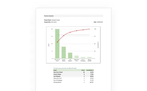
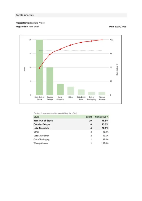
This template creates a Pareto chart of the causes of defects in a process ordered by priority, with the major causes highlighted.
Enter causes and their frequencies, and the spreadsheet will aggregate duplicate entries and sort the totals automatically.
How to Use This Template
- Open the template and on the Pareto Analysis tab, edit Project Title, Prepared By and Date.
-
Under Input Data, separately list all the names of causes of defects that you have collected.
It is common to add an "Other" category to the end of the list to group counts that are small for defects outside of the other causes.
See Data Collection below for more on how to collect defect data.
- You may enter a single count per cause or multiple counts across multiple rows for the same cause.
- Review the Pareto Analysis tab and check how many causes are responsible for 80% of the defects. These represent priorities for action.
- If Other is one of the highest causes, seek to identify the major contributors to the Other category, then repeat the Pareto.
Data Collection
To prepare data for Pareto analysis, you must collect the number of defects from a single process, product or service, labelled by their cause. It is possible to aggregate defect data across several processes, products, etc., but it may hide local differences and priorities.
Your data sample size must be sufficiently large to provide confidence in at least the highest priority categories. As this is discrete data relatively large samples, a hundred or more, are needed to generate acceptable confidence. With low-volume processes or low defect counts don't wait too long to get a bigger sample.
Choosing how to label causes is key to providing useful output. Having many causes that are unrepresented in data is worth little. A cause aggregating several different sub-causes is also useless in indicating the priority of investigation.
The usual approach is to name six or more causes that are represented with high frequency and list the remainder in an "Other" category. When the Other becomes one of the top 20% priorities or moves higher in the list than the bottom few, it is time to reconsider the individual causes included in Other and redraw the chart.
What is a Pareto Chart?
A Pareto chart is used in quality control to prioritise the causes of defects arising from a process in order of frequency.
It is a combined plot with a bar chart showing the number of occurrences of each defect in order of frequency, and a line chart, usually in red, of the cumulative percentage of the total.
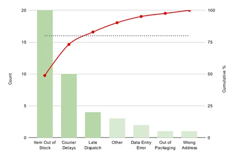
A Pareto chart should highlight the main causes that contribute 80% of all defects — those at, and to the left of where the cumulative percentage crosses the dashed line.
Pareto charts have become one of the go-to displays for process quality improvement. They are familiar to everyone involved in continuous improvement.
Pareto Analysis and the Pareto Principle
Pareto charts are named after the Pareto Principle, which, in turn, is named after the Italian economist Vilfredo Pareto.
In the 1800s Pareto claimed that 80% of all land in Italy was owned by 20% of Italians. Pareto's work was applied to quality control in the 1940s by Joseph M. Juran, who found that, as a rule of thumb, 80% of defects were caused by 20% of the causes. This Pareto principle has also been called the "80/20 rule" or "the law of the vital few".
Whether the principle is true for any given process or not, Pareto analysis has become the accepted way to prioritise investment in process improvement.
Pareto Chart Variants
A Pareto chart of simple defect count may be better at recognising the pain felt by customers in terms of the frequency of defects shipped. The assumption is that all defects that reach customers are relevant to them, and are more costly than the internal cost of failure.
Another variant of a Pareto chart uses the cost impact of each defect multiplied by the count. It recognises the pain felt by the business and shows the priority for financial savings.
On this chart, the left axis is in units of financial value ($, £, or €, etc.), while the right axis remains a percentage of the total. This cost-based variant may result in a different sequence order with higher-cost defects receiving higher priority.